A new look that communicates personality: Refreshing Intelligent Ink’s brand
PROJECT: INTELLIGENT INK REBRAND
2020
Brand Strategy | Brand Identity | Website Visual Design | Social Media Content Creation

When my friends Intelligent Ink approached me about a brand refresh, I leapt at the chance to get involved. We've worked together several times over the years with mutual clients, and I was keen to work with them on their own brand to give it a new breath of life.
Out with the old
Thought leadership content agency Intelligent Ink hadn’t revisited their branding since they began in 2011, and some aspects – such as their website and colour palette – were looking a bit tired. Additionally, their visual brand wasn’t effectively resonating with their target market (which had evolved over their years in business).
Intelligent Ink knew the importance of first impressions, and wanted to ensure their visuals were refreshed to catch the attention of their target market, while still feeling ‘Intelligent Ink-y’ and keeping their warm and friendly personality.


Refreshing the visuals
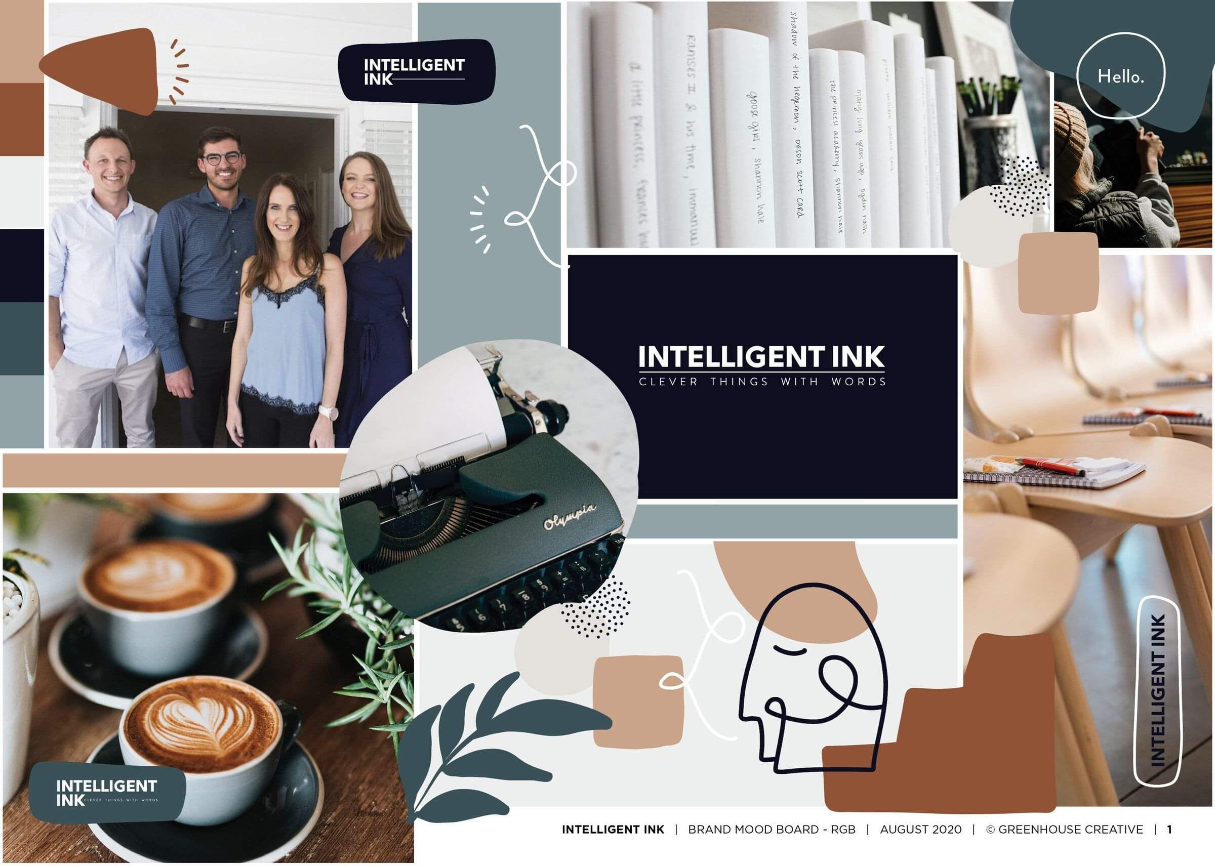
Ultimately, the Intelligent Ink team wanted to keep their much-loved original logo which has a structured, corporate feel, while refreshing everything around it to bring warmth and personification to the visual brand.
To get an idea of the refresh, I started off with a Q&A with Christina and Verity from Intelligent Ink, considering their values, purpose and personality. Afterwards, I created some colour palette and font options for Christina and Verity to consider, and talked them through the psychology behind each one.
“We liked how Tonia took the time to explain her rationale behind each option, and went into detail about why each colour and font had been chosen,” recalls Christina. “And when we were struggling to decide on which brand design we wanted to go with, Tonia took the time to create mockups of our favoured options in situ to help us make up our mind!”
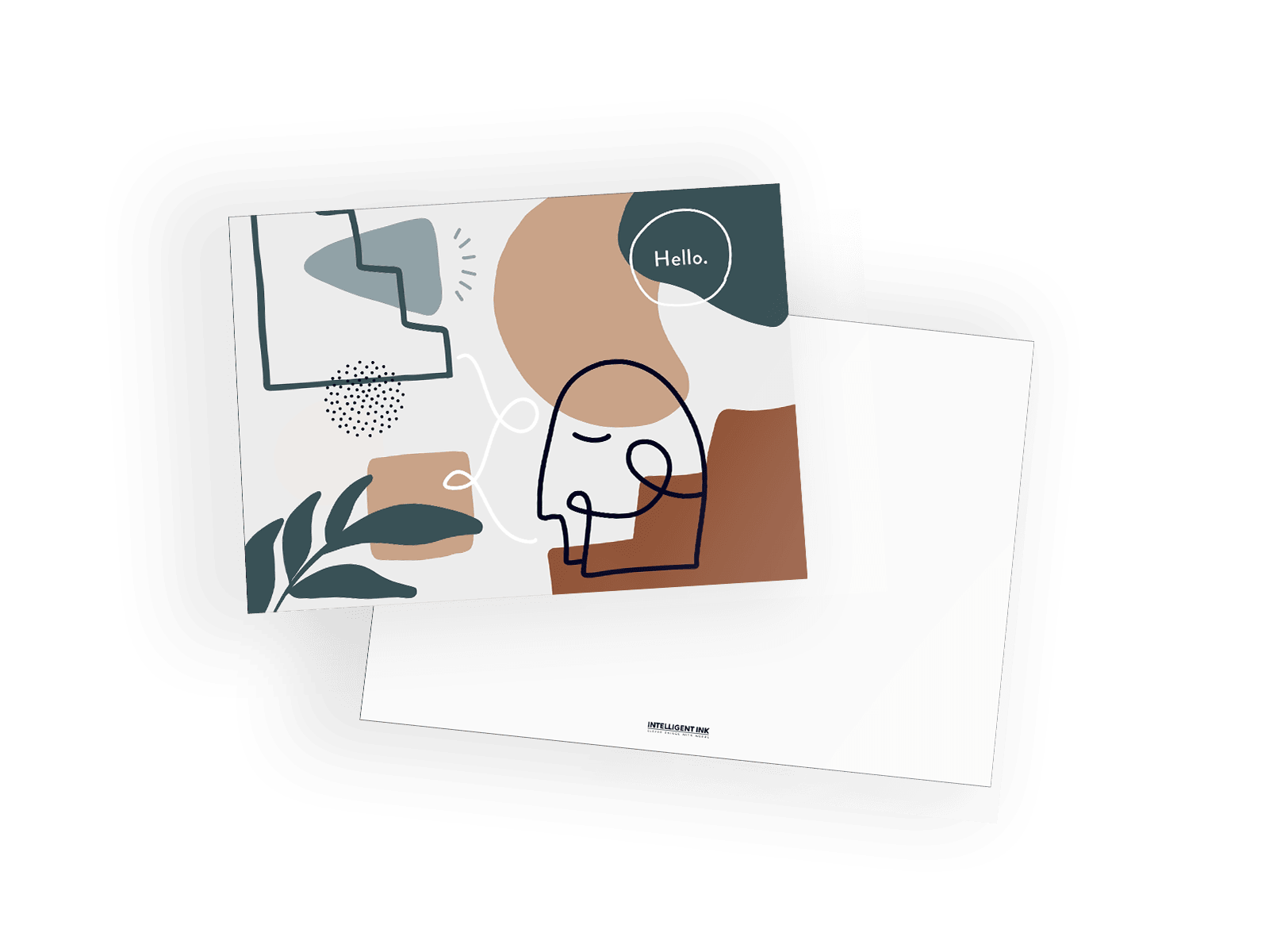
Along with the new colour palette, I also created some abstract imagery for Intelligent Ink’s brand to reinforce some of the values we had discovered in our brand strategy session. In the end, they decided to introduce the imagery across all of their platforms to visually share a few of their values – the head and brain to symbolise intelligence, the megaphone to symbolise the importance of a voice, the cluster of dots to symbolise connection and community, and the steps to symbolise elevating impact and rising above the rest.
“What we really loved was that Tonia wasn’t afraid to try something new with us with the abstract visuals,” says Christina. “It wasn’t part of the original plan, but doing so really opened our eyes to the brand’s potential and versatility. It got us really excited about rolling it out everywhere!”


In with the new
“Tonia didn’t go over the top and respected that we didn’t want to change our logo. She instead put all her energy into making everything around it look great,” says Verity.
“The new visuals have helped Intelligent Ink grow up and mature, whilst also keeping the warmth we love. Now we feel so confident in our brand – and are actually excited to send people to our website!”
Design
+ Brand clarity
+ Brand strategy
+ Digital strategy
+ Marketing strategy
+ Digital systems & toolbox
Cultivate
+ Ecommerce
+ Landing pages
+ Digital marketing
+ Google adwords
+ Social media marketing


