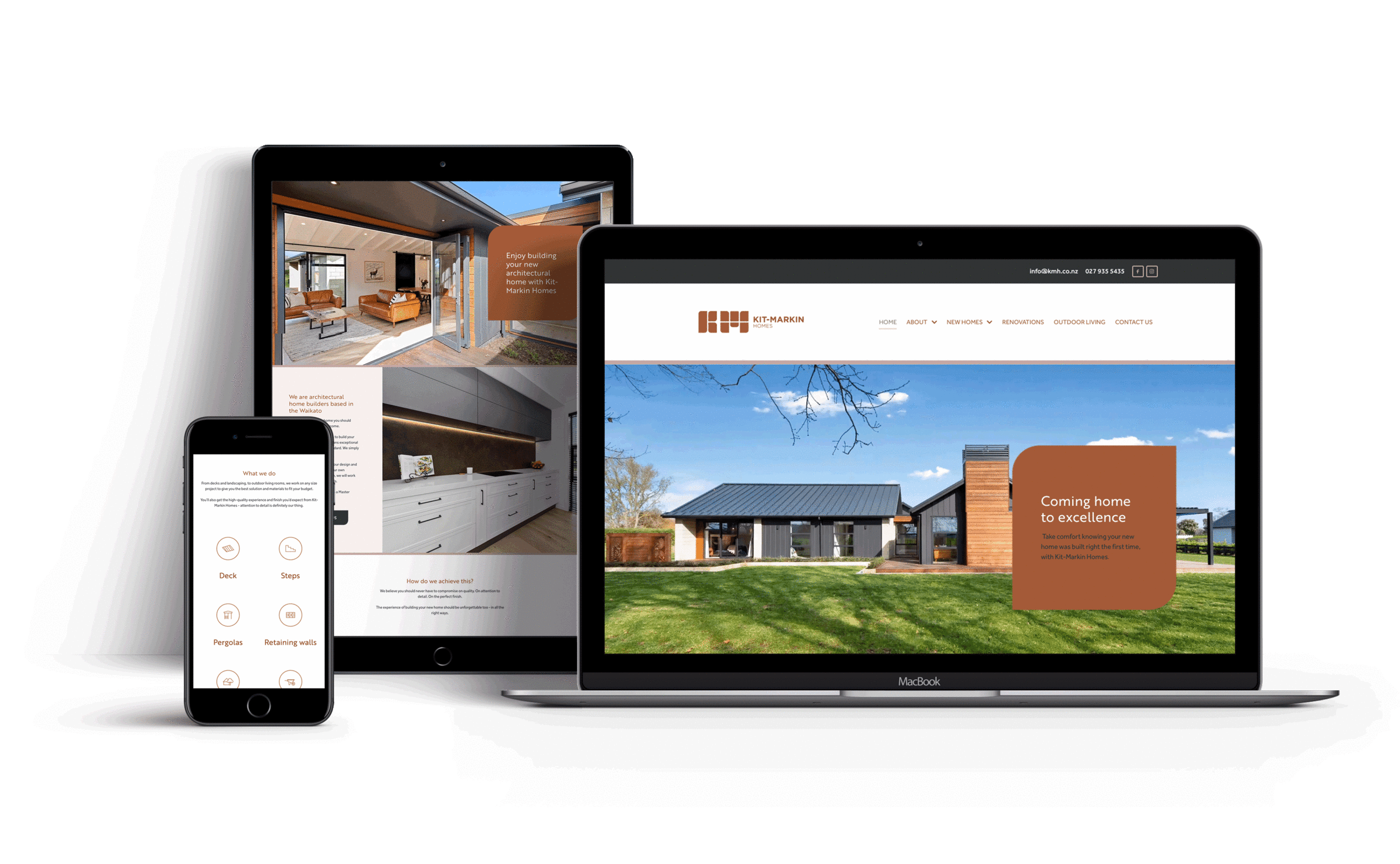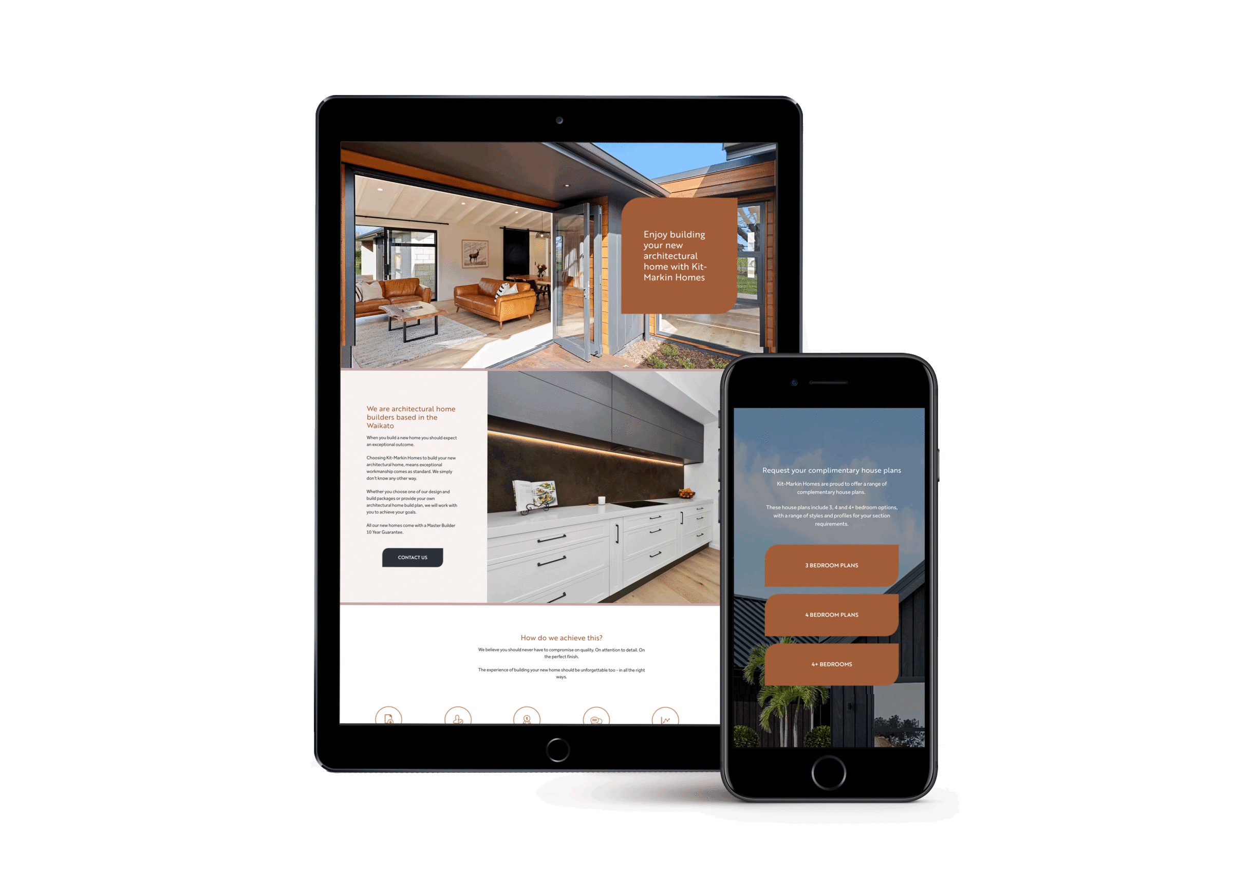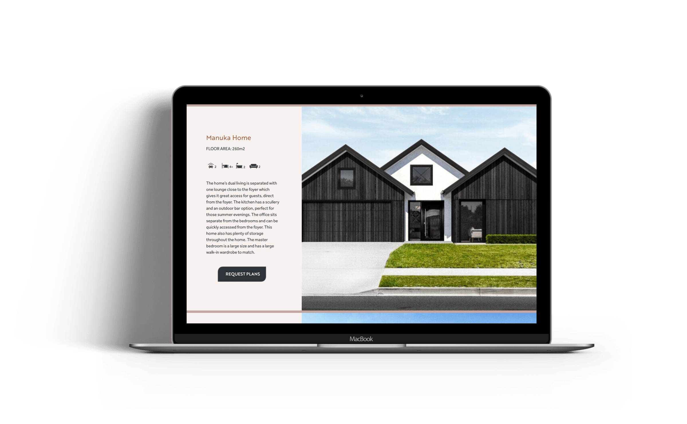
Kit-Markin homes were already an award winning design and build company but they were in desperate need of a website that showcased and complimented the quality of their work. Their existing site didn’t reflect their core brand values of high-quality workmanship and top-notch customer service. It had also become very clunky with the back end technology causing them lots of issues and delaying their ability to respond to enquiries in a timely fashion.
Since their new website has gone live they have noted an increase in the number and quality of the enquiries they are receiving. Most importantly of all, they are actually receiving all of the leads and enquiries being generated via the website so they are able to act upon them immediately instead of these getting lost and they are able to qualify and follow up on their high-value leads in a manor consistent with their approach to customer service.
It was evident from the start that the overall design of the website needed to be about their stunning builds and the quality of both their product and service. They had many high quality images of their projects so I wanted to utilise these and create a very clean website that really showed these off. I used their images to create a series of feature area videos, which bring an element of movement and interest to the site, as well as drawing the viewer into the physical space of the homes on show.
"I really wanted the viewer to imagine themselves inside their own stunning new build, as opposed to be simply viewing a builders website."

I created custom shape graphics with inspiration pulled from the company logo and I used Rocketspark’s column stack features to create an overlay on top of the videos so that we could display key statements that also relate back to the companies values without losing the text inside the videos. This created a sense of balance and movement between the visuals and written content of the site.
To enhance the sense of quality in the final design of the site I also created some custom buttons and elements that were used throughout the website which aligned with the overall look and feel of the visual brand. These touches reinforce and compliment a sense of attention to detail that is evident in their physical work, again adding to the message of quality.
With any website design, it's important to also consider the ramifications on the mobile experience when creating something a little more complex, as with this site design. By designing the desktop and mobile sites at the same time, I ensure that any innovative web design techniques I implement will be translated well across all device types.
The client had a really impressive catalogue of work and images that we were able to pull from for the site and they were very keen to show off all their work and capability on the website. The biggest piece of advice I gave them was to focus on their ideal projects and clients and to target their messaging towards these projects and clients only. To do this we kept the copy to the point and used custom designed icons to communicate large ideas in a visually succinct way, rather than trying to explain each and everything the business could potentially do, in detail.

"It’s really important to consider the bigger picture when building a website, so that considerations for marketing and calls to actions can be implemented with purpose"
As part of my briefing process with each website build, I ask what the customers marketing plan is: how are people expected to find the site; where have they come from; and what point in the buying journey are these people at; what are they expected to do next…
Often, there are many different scenarios that a user could fall into when asking the above questions, so we limit this to the three most likely scenarios and build the website with these three scenarios in mind.
One of Kit-Markin Homes marketing techniques is to offer free house plan downloads from their website. They advertise these free house plans by Google Ads and through their social media channels. So it became really clear that I needed to include a dedicated landing page for viewers who were arriving to download houseplans.
This has meant that the user journey is considered and we are providing the user with the best possible experience – in line with the Kit Markin values.
The biggest change for Kit Markin is that they now have a professional website that truly reflects and represents them as a brand. As soon to be recipients of industry building award, they were very mindful that existing site did not hold up to this and needed to make a change before any media and PR started creating attention on them. They now feel more confident that when people come to the website that they will be getting the right perception and message about them and the work they provide.
There is now a sense of consistency that flows through the entire website, making it feel like you are flicking through a high quality catalogue of stunning projects. In addition, the customer now has a website that attracts potential customers and allows them to market, capture and manage their enquiries in a manner that is befitting with the values of their brand.
Design
+ Brand clarity
+ Brand strategy
+ Digital strategy
+ Marketing strategy
+ Digital systems & toolbox
Cultivate
+ Ecommerce
+ Landing pages
+ Digital marketing
+ Google adwords
+ Social media marketing


