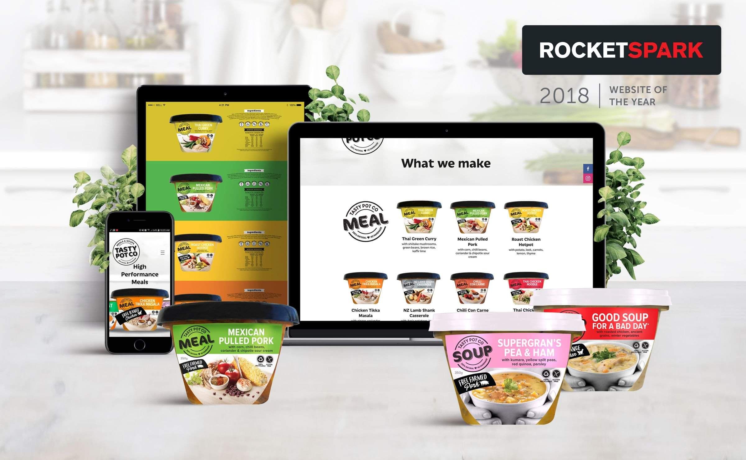
Bold & colourful Rocketspark website design, with lots of engaging content to showcase
The team at Tasty Pot Co came to me in desperate need of a modern website. Their previous site would have been the bomb-diggity in it's day, however the technology had become obsolete and rendered the site next to useless on modern browsers.
Being an FMCG brand, stocked in all major supermarkets in New Zealand, they didn't require an e-Commerce site but they have the ability to add e-commerce to their site at the click of a button should that requirement change.
The Tasty Pot Co brand is modern, vibrant, bright and cheerful. The health, nutrition and optimism of their brand needed to shine in their new website design.

Award-Winning Website Design
Shortly after the site launched, the website design for the Tasty Pot Co won Crisp Graphics the Rocketspark Partner Site of the Month in July 2018.
At the Rocketspark Conference and Awards Dinner in August 2018, Crisp Graphics won the Website of the Year Award as voted by the Rocketspark Design Partners across Australia and New Zealand.

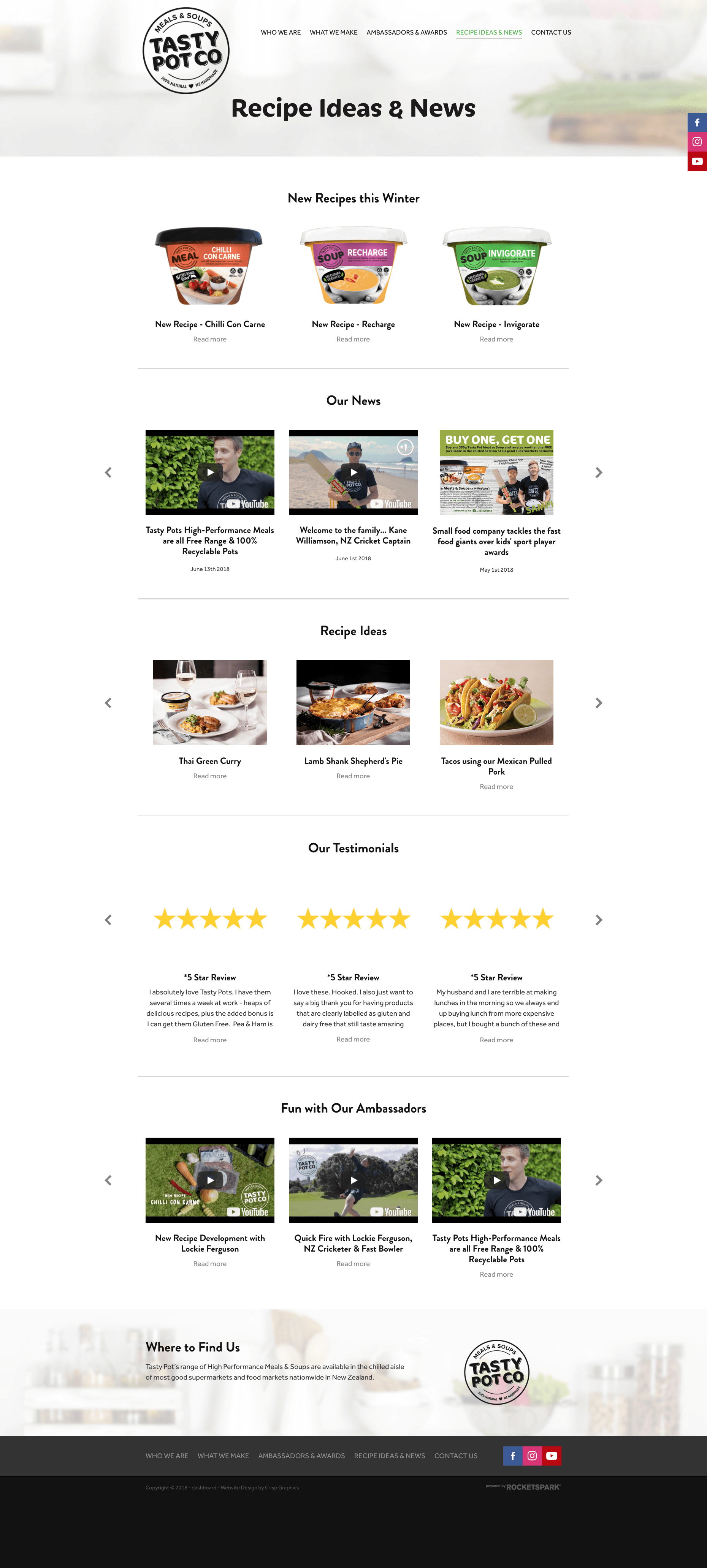
One standout feature of the Tasty Pot Co Rocketspark website is the use of the new blog sliders on the Recipe Ideas and News page. Tasty Pot Co have a lot of content & information to share with their customers and suppliers, whether it be new products, recipe ideas, videos from their impressive list of ambassadors, news or testimonials.
I created a blank page to house their blog content, which enabled me to tag and sort the blog posts into an organised page with an easy to digest format, with the use of the new blog slider stack feature.

Another area of the site I love is the "What We Make" page. Using the existing packaging designs and making the most of their bold colour choices, the meal and soup menu section at the top of the page showcases the products in a crisp clear concise way.
The picture tags jump the viewer down the page to more information on their product of choice and the vibrant background stacks really bring to light the playful, friendly, healthy nature of the brand. The nutritional information and ingredients lists are intentionally kept as images to maintain brand consistency and are able to be viewed larger as a pop-up with one click for those who may have trouble reading the initially smaller print.
To balance the use of vibrant colour in the product packaging, the client and I decided upon a clean, white kitchen background image to feature across the headers for every page. This design showcases the brand in a manner consistent with all existing offline brand collateral.

Here's what Tasty Pot Co had to say about working with me
"Recently Tonia worked her magic on our massively out of date website. We’re super happy with the end result. It’s clean, fresh and show cases our products well. Tonia was professional, relaxed and positive about everything we threw her way. We’d happily recommend Tonia at Crisp Graphics. From the team at Tasty Pot."
Design
+ Brand clarity
+ Brand strategy
+ Digital strategy
+ Marketing strategy
+ Digital systems & toolbox
Cultivate
+ Ecommerce
+ Landing pages
+ Digital marketing
+ Google adwords
+ Social media marketing


